Devgenome
An IT, software and AI company's website, rebuilt twice: in July so it read as a real firm, in September so it looked like nobody else.

// round two, the idea
An engineered double helix
The September site is built around it: six mechanisms, each captioned with a part of the work, assemble as the visitor scrolls, then the helix opens onto the enquiry. Every part was modelled for this site. This is one of the six.
// taken apart
The helix is the client's, so this page doesn't host its scene. It shows stills rendered from it, and one of its mechanisms, the one for AI, taken apart.
// a rule from the brief
By default, every part that lights up sits in a housing it emerges from, instead of scaling up from nothing.
// back in place
Seated again on its piece of the client's rail. The scene that ships was compared frame by frame with its Blender export: 3,002 frames, 0 failing.

// three rounds
One page, then ten, then fourteen
Devgenome is the trading name of Developer Genome Ltd, registered in England & Wales. By September the business was IT support, software development, AI and automation, and the old wording no longer described it.
-
 Home, the only page
-
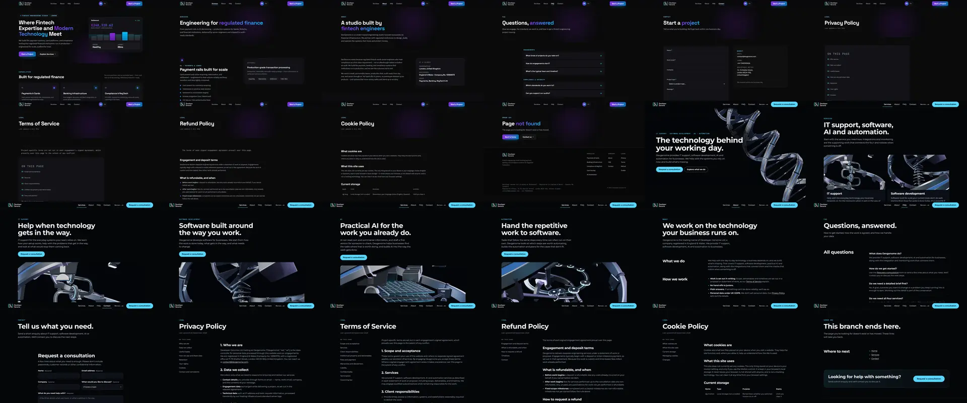 Home
Home- Services
- About
- FAQ
- Contact
- Privacy
- Terms
- Refunds
- Cookies
- 404
-
- Home
- Services
- IT support
- Software development
- AI
- Automation
- About
- FAQ
- Contact
- Privacy
- Terms
- Refunds
- Cookies
- 404
The July pages are captured from the July build as first committed to the project's history (25 Jul 2026), served locally. The one page before July is rendered from its original files, still kept from the server on 30 Sep 2026. The September pages are captured from devgenome.com on 2 Oct 2026.
// model to browser
The same helix, from model to browser

01 Wireframe

02 Clay

03 Lit
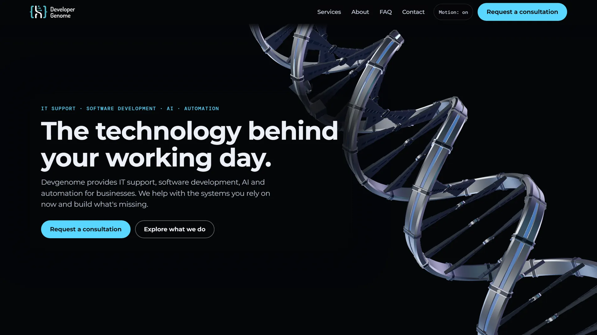
04 The live site
// what shipped
What went live on 30 September
- Fourteen pages. Home, services, IT support, software development, AI, automation, about, FAQ, contact, four legal pages and a branded 404, served for any unknown address since 2 Oct 2026.
- "Request a consultation" everywhere a visitor is ready to talk: spam protection, a sending limit, the mail password kept outside the website, and if sending fails the visitor keeps what they typed and sees the email address instead.
- A loader that reports real progress. Download first, then preparation, so the scene starts ready instead of popping in.
- A second-edition brand book for the new identity. It's the client's, so it isn't shown here.
What the client said after round one
July 2026, first round
“Ed rebuilt the site start to finish and handled the whole thing without fuss. Clean, fast, properly thought through — every page holds together and it works the way it should. What stood out was the handoff: a full interactive walkthrough of everything that was done, not the usual two-line email. Done well, done quickly. No complaints.”
// the receipt
The numbers, with their dates
DEVGENOME.COM · RELEASE 1.2.0
LIVE SINCE 30 SEP 2026
- Pages
- 142 Oct 2026 · 13 in the sitemap plus a branded 404, served for unknown addresses
- Third-party calls
- 0 on all 14 pages2 Oct 2026 · every request recorded in a fresh browser, desktop and phone
- Home page, first load
- 12 requests at load on a phone, 18 on desktop; 26 and 7.2 MB once settled2 Oct 2026 · counted to the load event, then 12 s settled
- 3D on screen
- 12–15 s unthrottled · 22 s at 9 Mbit/s · 52–54 s at 1.64 Mbit/stwo runs, 29 Sep 2026 · local server, emulated links; the loader is there because of the last one
- Frames compared with the Blender export
- 3,002 · 0 failingrelease record · frame by frame against the source scene
- Planted defects caught
- 12 of 12 · 0 on the clean copyrelease 1.2.0, 29 Sep 2026
- Live HTTPS checks at go-live
- 6330 Sep 2026
- Live files against the delivery
- 62 of 62 byte for byte2 Oct 2026 · SHA-256 of every public file, against release 1.2.0 plus the 30 Sep update
- Scrolling on an iPhone
- steady 60 fpsOctober 2026 · watched by me on the live site, not instrumented
- This page, first load
- 27 requests to the load event, 11 of them the 3D (1.5 MB: engine 860 KB, model 243 KB, lighting 395 KB) · 0 third-party2 Oct 2026 · this build served locally, uncompressed, empty cache, desktop and phone
MEASURED OR WATCHED, NOT ESTIMATED